Attempt at a storyboard and plot sequence planning before collaborating on the sticky note storyboard:
planning out the layout of the scenes.
We all thought about making our own storyboards and then comparing, but then found a better way and did that instead.
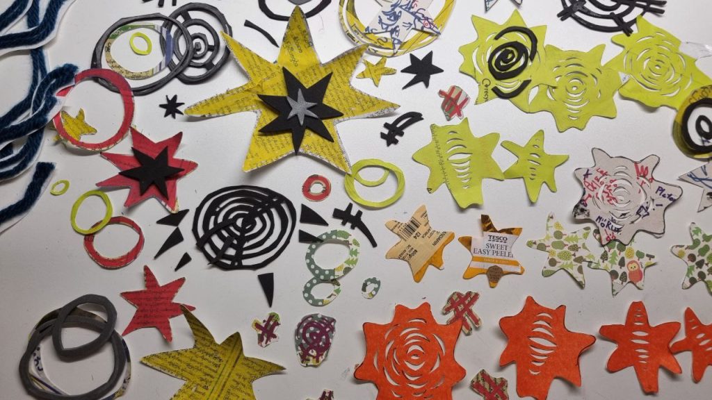
Experimental storyboard test with all of our thumbnails:
Something that a lot of storyboarders do is draw scenes on sticky notes and move them around to create a cohesive narrative. We were mainly inspired from JC Quintel’s regular show storyboards that he would pitch to the producers.
We made our own little scenes of the story, and then compared and use it to shape the way are animatic is supposed to look like. So it was a collaborative piece that gave us a lot of ideas of how 1 scene could be told in many ways.
The ones in purple and orange are my sketches:
Environment Concept and Set Planning:
During the time that Jacob was figuring out the story further to fit in the 20 seconds, Deran and Emmanuel were designing the pigeons whilst I figured out how the environment should look like and how we could make it. I got some suggestions and ideas from Jacob with some of my sketches. But since its very ambitious, and out of the new story, a lot of these were scrapped.
Although I did attempt at looking for artists and resources, we didn’t adhere to any of the particular styles they had, due to the constant changes in the themes and ideas of the story. I did write short notes on them in the last post:
During the beginning of the project, our group – Deran, Emmanuel, Jacob and I, decided to collate a bunch of ideas and develop them into a story with a intricate lore. We looked into each other’s interests and strengths – which lead into an idea involving Mecha robots and fight scenes. We wanted to make something quite epic within the 20 seconds we were given.
I thought up about maybe having it be something related to pigeons if it were a fight scene since they were used in the bombs in the World War. It would also create an interesting plot twist to see a giant robot manned by a tiny pigeon seeking revenge.
This led us to another pathway – with a pigeon seeking revenge for it’s mother killed by deforestation. But over further feedback and discussions this was scrapped too since there was too much story to tell within 20 seconds.
Pigeon doodles and ideas (1)Second pigeon story discussion (2)writing out what transpired during the discussion to rememberQuick storyboarding of the scrapped fight scene)Scrapped fight scene (2)
Upon further feedback from our tutors for our plot, they believed that it was not as personal of a story as intended, and was rather a surface level plot that needs to dive deeper. Thus, we decided to connect stories of our own personal challenges in the past and find a pattern within it.
We came up with another plot-line where we see the pigeon fall into a lava pit, and then fly back out with some struggles in the middle, like an abstract moving image of sorts. I also tried looking to a lot of artists who convey the feeling of loss.
This did led me down a rabbit hole of lithography print making techniques and performance artists like Marina Abramovic’s works – but were however scrapped since we had to change the storyline in another sense of narrative/perspective and cut it further down.
In the end, we decided to create an antagonist character (eagle) to add more urgency and a focal point to the story. This did shift the tone and mood of the story into a less poetic and more comedic way, but since it fit in with the 20 seconds we used that plot instead.
Within this rotation, we learnt how to use after effects to create a self portrait sequence.
Reflection for 2D motion
Due to the fact that the past animation I’ve made involved very abstract shapes and concepts, this time I want to create something with more physical form and meaning. Thus, I created the rat. After some sketches and thinking, I believed that the rat has the most similar characteristics that defines me in some sense (such as smelling food or hoarding items) I also thought that having an establishing animal with it’s real life characteristics sets up a predetermined expectation out of the audience in some sense. I mainly used rounded shapes inspired by the character designs in “Bluey” (analysed in previous posts) and the Disney standards to evoke a softer and friendlier feeling of the rat. Also, with some inspiration from the tutor Jess’s works, I blocked out the colors for all the shapes without any strokes and created something fun and light-hearted rather than emotionally deep sequences.
Learning from the problem encountered during the stop motion rotation where I rushed the screen time by trying to fit in many elements in 5 seconds, I only picked 2 main actions for this sequence so that I can hold onto some frames longer for the audience to fully interpret before it moves on.
For what went well, I think I successfully managed to tell a convincing story with a beginning and an end – with a personally appealing art style of After Effects. It didn’t feel as cheesy as I thought it would be, but still managed to capture the emotion and feeling based on people’s feedback and ideas during the screening. I think the way I structured my production process was very time efficient and effective – as I first started animating the main positions of the characters, and then going in and adding secondary actions and details afterwards. I loved how the texture at the background doesn’t exactly distract the viewers, but added to the comic-like style of the rat. Having it boil brings out the form of the rat as well.
However, to improve upon this further I think I’d try to expand on the rat’s expressions in the beginning. I made it very interpretive to the viewers by just having it eat the cherry. I could’ve have it react to it in some way before it spins out into oblivion. I think that when it was spinning as well, I could’ve animated the arms and legs moving before I made it spin since now, it was harder to track the movements as it was spinning. Maybe next time I could also create a personal character with proper character concepts rather than just drawing a generic rat.
Feedback I Received:
The feedback I got were mostly positive, where they said the rat felt very alive and that the color scheme was overall visually appealing and that the timing has a good rhythm. I should’ve time the sounds better as there was some confusion on whether the sounds are made from the movements of the rat or the cherry. So I’ll fix it a bit before submitting it.
Overall, I really liked using after effects, despite at times it being very complicating and fiddly.
Boiling texture I made using procreate brushes and the “halftone” filter
I did consider maybe texturing the rat and cherry instead, but after testing it out, I felt that it distracts the audience away from the main movements. I just stuck with texturing the outlines of the shapes instead. Although I also find the version without texture appealing in itself with the simple colour scheme, the boiling background subtly added dynamic movement within the overall composition. I love how it slightly created a comic-like effect, further adding to the cartoonish movements of the rat.
In terms of the timing, I love the rhythm of how each elements of the composition is introduced.
Make a 5 second “self portrait” animation using after effects with 24fps, 1920×1080 px set up.
<> It needs a change of narrative rather than just a moving image. (Different beginning and ending)
<> Needs colour, texture, composition, repetition and rhythm
I decided to work on something more physical this time, rather than making something experimental like my stop motion. This is so that I have a grasp on how to make proper character animation as well. I was quite inspired by “Bluey” ‘s stylistic choices in character design, and thus my sketching process begins.
My sketches for the self portrait
So far, I wanted to keep working on the cherry that I made – since I love how I sculpted that. To go off of that, I decided to create a rat. To link this to the brief, I’d consider myself to have a rat like personality, where I sniff any food that I eat, and hoarding items that interests me. When picturing the sequence, I interpreted a lot of swirls, or (the motion of it) since at times I feel like I’m just riding on the waves of confusion and life, whilst cruising on it to guide me to where I’m supposed to go (in a way). Although I pictured making a washing machine element, depending on time restraints and timing, I would further cut down elements when I need to.
Focusing more on the character designs, they use all three main shape languages, but forms them in a way where the characters looks blocky, but still soft and round through the rounded corners.
Most of the shapes within the character don’t have an outline – and the outlines outside the main figures differentiates the character out of the background in a non-distracting way using a darker value to the colour of it’s shape.
I noticed that they used around 4 colours (which has very calm changes of hues and contrasts using analogous and split complimentary colours)
I think that I would like to implement the colour palette and shape language into my work to create a visually appealing and overall connected and well put sequence. However, since I would prefer a textured outline or more blocked out shapes, I wouldn’t concern myself with outlines for now.
Work In Progress:
Making the main shapes and dissecting the body (so that the mouth can open)Zooming out to see the rat, before it eats the cherrySome key frameslayersIt was difficult to keep track of all the little elementsRealising that I can change when the element appears/disappears
At the first stage, I mainly focused on making the puppets and the timing of each main keyframes. Because I can go back on the frames and elements later onwards, getting the main actions done was my main priority. I tried to keep the main colour palette as simple as possible – using only 4 colours with a semi quadratic colour scheme. I chose these colours mainly since I want to evoke moody ambience, with some suspense for the rat, and also to just have the rat and the cherry pop out of the background further to be focused upon. The negative dark blue space also makes it feel like they are floating in the abyss and space.
First draft of video:
During the time of animating this, I thought that this by itself could be passable. However after a second look, the rat felt quite stiff and creepy.
Animating tiny elements of the rat:
I went in and accentuated secondary actions of the ears moving so that it gives and illusion of the rat moving into frame rather than zooming out. I also added some sniffing from the rat for them to interact with the object further.This was me figuring out media encoder to start exporting my work:
Second draft of the video:
For now, I was quite satisfied with the motions, and look forward to Monday’s workshop on adding further texture. I’m also planning to ask my tutors about their opinions as well.