Lip-synched animation
Reference videos from internet:
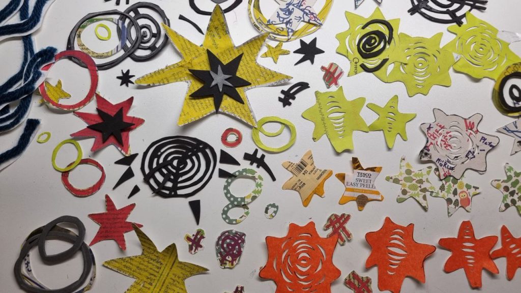
Keys and Timechart animation:
Coloured version before composition:
https://www.pexels.com/video/tiny-white-dust-particles-on-black-background-9665235/
Final Animation with Composition
REFLECTION:
During the 5 weeks of my Lip synch Elective, I’ve gained skills of the production pipeline from the beginning stages to the very end. I had enjoyed the process in general, and was proud of myself for completing everything within the allocated time frame.
I looked into “Chowder”(2007)’s use of character designs. They use a variety of shape language and size to exaggerate the silhouette and personality of the characters.
For instance, Schnitzel’s design uses a long rectangle with stubby round arms and legs – thus creating a somewhat more serious and unmoving character, which contrasts the more rounded curved shapes of Mung Daal’s whereas his design evokes a more carefree and spontaneous nature. Within the animation, their expressions exaggerate and add to the character acting done in the body – which I practiced within the “Oh it’s still alive” scene. In the beginning stages, I also wanted to add the patterned texture within my characters like theirs, however, after coloring the animation, I felt that it would be too distracting since my background also has a lot going on.
Within the production stages, I struggled a lot with figuring out the storyline and how it connects with my background and character designs. Narrowing ideas down to one is usually a difficult process for me, since at times it either feels like something is missing, or just to scrap an entire idea in general. In this case, around the middle of the production, I had to go back to the drawing board of figuring out my plot after my story with the tiny human felt like a complex concept to explain within the 15 second timeframe.
However, once the plot was set, designing my characters and getting to draw keyframes and in betweens of them was really intriguing to me – as it challenges me to think in 3 dimensions within my designs and character acting. I specifically chose a cartoonish design so that I can imitate the rubber hose animation style and experiment with funky stretch frames. This allowed me to focus on the character acting and extreme expressions whilst not worrying too much about realism. In my future projects, I’m curious to push these squash and stretches further by having characters morph into one another, or to have the characters interact with the space around them. I think that I could also learn to create subtle expressions within human characters as well. In the in-betweens, I tend to use the Time chart which prolongs the middle frame the most , so the actions feel more bouncy and somewhat upbeat in rhythm.
Although the idea of coloring my lineart is fun, since my lineart weren’t attached, I manually coloured in each frame, which was quite an annoyingly slow process for me. Since I was using double colors for the shading as well. It was especially difficult to remember where the shading of the last frame was, and to keep it consistent.
In terms of time management, I’m quite surprised that I remained motivated to work consecutively for weeks non-stop. However it was a health concern since my wrists started hurting by the 4th day, and I’ve noticed I’ve been more impatient or sad in random periods of time. Doing this allowed me to know my limit on how much is a reasonable amount of work to do, and how much more time I need to allocate for my personal time so that I don’t lose control of myself. Despite all that, I’m surprised and proud of the workload I did, and I would like to do this all over again.